Coxcomb diagram
May 25, 2025While exploring new ways of visualizing data, I stumbled upon an interesting circular chart. At first glance, it looked like a flower, but it wasn't quite like anything I'd seen before. This chart is known as a coxcomb diagram. I began to search for its origins, because the name didn't ring any bells, and that's when I encountered the story of Florence Nightingale and her pioneering work in data visualization.
The coxcomb diagram, also called a polar area chart, is a type of circular histogram that segments data around a circle. Unlike a typical pie chart where the angle represents the quantity, in a coxcomb diagram all segments have the same angle, but vary in radius, so the area represents the value. This makes it ideal for comparing proportions over time, especially when dealing with periodic data such as months in a year.

Florence Nightingale, known as the founder of modern nursing, was also a gifted statistician and an early advocate of using data to drive decision-making. During the Crimean War (1853-1856), she meticulously collected data on the causes of death among British soldiers. What she found was surprizing: far more soldiers were dying from preventable diseases than from battlefield wounds.
To communicate this finding to government officials, many of whom were not statistically trained, Nightingale turned to data visualization. In 1858, she created the coxcomb diagram to clearly and persuasively show that unsanitary conditions and lack of hygiene were the primary killers in military hospitals.
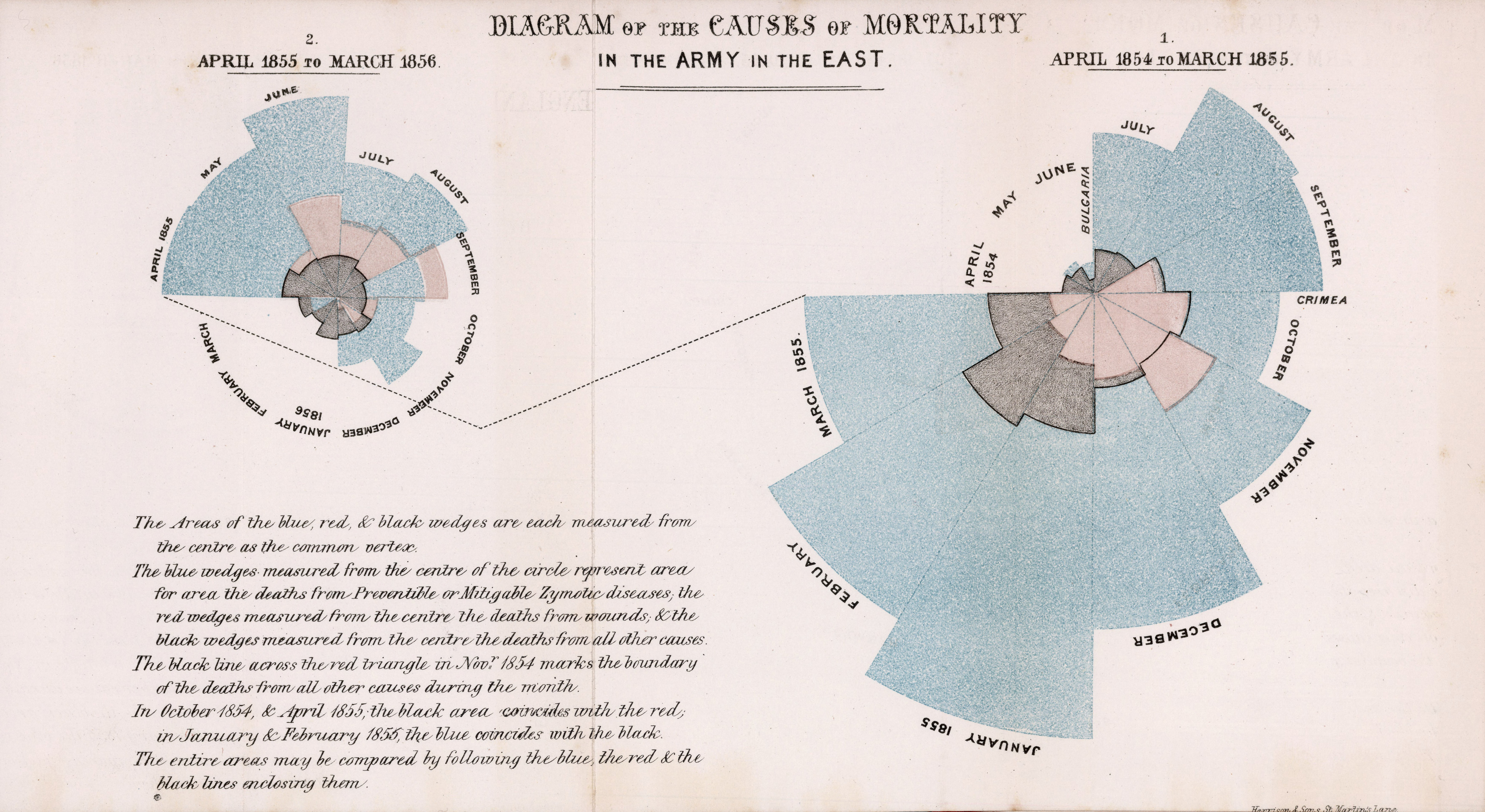
This diagram is divided into twelve segments, one for each month. Each segment is split into three colored areas representing deaths from different causes: preventable infectious diseases (light blue), wounds (pink), and other causes (dark gray). The area of each colored wedge grows outward from the center in proportion to the rate of deaths. What's immediately visible is how dominant the light blue areas (disease-related deaths) are in general, compared to the relatively small pink and dark gray wedges (representing wounds and other causes).
I could conclude this post here, as the story so far is already remarkable enough. But I chose to go further: I wanted to see whether I could recreate these diagrams using modern tools.
The first step was to get the corresponding dataset. I used an open data repository that gave access to Florence Nightingale's Data on Deaths. This dataset provides information on the size of the army and the number of deaths, along with corresponding mortality rates, attributed to preventable infectious diseases, wounds, and other causes, covering the period from April 1854 to March 1856. This was exactly what I needed.
My first goal was to recreate the original diagram as faithfully as possible. After a couple of unsatisfactory attempts, I managed to get the following result:

Once this step was performed, I allowed myself to start experimenting, as I was curious to explore alternative ways of using circular diagrams. I decided to split the two circles in half and add a circular grid to the layout. I also rearranged the diagram so that time flows from left to right, then top to bottom, making the chronological order easier to follow.

This particular result made me wonder if visualizing data as such was really convincing. This doubt emerged from the fact that, although the vehiculated message is clear, mainly because a few months show overlapping segments, and some wedges are so small they are difficult to interpret. So, I decided to explore what the diagram would look like with a flattened axis. Or, to put it more plainly, what happens if I just use a regular histogram.
To create a closer visual comparison to the original coxcomb diagram, the square root of the rate was used to better match its visual proportions. Additionally, the same grid was applied to maintain a consistent visual reference. By eliminating the circular axis, a significant amount of space was saved, allowing the visualization to appear clearer simply because it could be displayed at a larger scale.

Given that histograms are not conventionally read in terms of bar area, I chose to continue using the rate values instead. As a result, the initial gap between the different categories becomes more pronounced. In this case, the axis could reflect actual values from the dataset, but I chose not to include them, as they are not the focus of this visualization.

What started to bother me with this configuration was the overlapping of data. Even though the bars are semi-transparent, it can still be difficult to track the progression of a specific category or understand its value compared to other categories, particularly when it's not the light blue one. I considered two options: either displaying the categories separately or stacking them.

I believe both approaches have their strengths. Displaying the categories separately makes it easier to follow the individual trends of each category. On the other hand, stacked bars provide a clearer sense of the overall proportions, almost as if each bar represents the share of total deaths.

In fact, after bringing up proportions, the idea of showing the percentage breakdown of the three categories naturally followed. This final visualization is also quite interesting, as it highlights the relative proportions of the three categories. Of course, it doesn't convey the actual number of cases, something the previous plots do provide.

I should probably emphasize that I don't mean to reinvent what Nightingale already accomplished, nor to suggest her work could have been improved. My goal was simply to explore data visualization for the sake of curiosity and creativity, to see what alternative approaches might exist.
That said, it's worth emphasizing, especially if you weren't already aware, that Nightingale's original diagram was far more than an artistic exercise. Through this compelling visual argument, Nightingale successfully influenced reforms in military healthcare and sanitation practices. Her diagram is not just a historical artifact, it's a reminder of how powerful a well-designed visualization can be in changing minds and, in that specific case, saving lives.