Minard's chart
June 29, 2025I have to admit that history has never been my favorite subject. Back in school, I struggled to remember key dates, which seemed to be the main focus, despite the fact that I've always found it easy to recall birthdays or stories people share. However, I've recently come to appreciate history from a different perspective: it's actually a great source of data for analysis. And with modern technologies, it is easy to recreate visualizations and plots that bring historical patterns to life in new ways.
In the previous post, you got a glimpse of the power of historical data visualization through Nightingale's coxcomb diagram. This time, I came across another interesting historical chart, one that Edward Tufte has described as "probably the best statistical graphic ever drawn". This chart is the now well-known Charles Minard's 1869 visualization of Napoleon's 1812 Russian campaign, illustrating not only the size and movement of the army but also the temperatures they faced during their retreat.
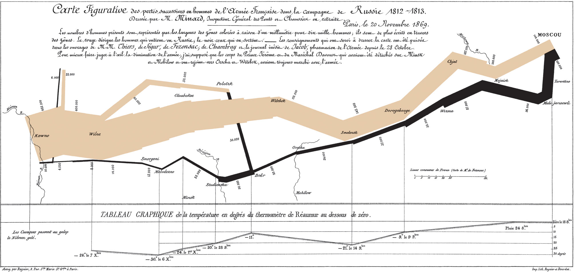
The chart is split into two sections. The upper portion traces the routes taken by the three divisions as they advanced toward the north, Polotsk and Moscow, as well as their retreat. The accompanying French description can be translated as follows:
Figurative Map of the successive losses in men of the French army during the Russian campaign of 1812 - 1813.
Drawn by Mr. Minard, Retired Inspector General of Bridges and Roads.
Paris, November 20, 1869.
The number of men is represented by the width of the colored bands, at a scale of one millimeter for every six thousand men;
the numbers are also written across the bands.
Red indicates the men entering Russia, and black those returning.
The information used to create the map was drawn from the works of Messrs. Chiers, de Ségur, de Fezensac, de Chambray, and the unpublished journal of Jacob, a pharmacist with the army since October 28.
To better illustrate the army's decline visually, I assumed that the corps of Prince Jérôme and Marshal Davout, though they had been detached to Minsk and Mohilev and rejoined near Orsha and Vitebsk, had marched with the main army throughout.
The lower section displays the temperatures encountered by the army during their retreat. The temperature values are expressed in degrees Réaumur. To convert from Réaumur to Celsius, the Réaumur value should be multiplied by 1.25. For example, -20 degrees Réaumur is equal to -25 degrees Celsius. The title can be translated as: GRAPHICAL TABLE of the temperature in degrees Réaumur below zero
Side note: The way the months are labeled in the temperature section is worth expanding on. October is written as 8bre (Octobre in french), November as 9bre (Novembre), and December as Xbre (Décembre). This convention comes from Latin, where octo, novem, and decem mean eight, nine, and ten, respectively. In the ancient Roman calendar, the year began in March, and the months were named Martius, Aprilis, Maius, Iunius, Quintilis, Sextilis, September, October, November, and December, corresponding to the modern months of March through December. The first four months were named after Roman and Greek gods (Mars, Aphrodite, Maia and Juno), while the remaining six were simply numbered, starting from the fifth month. When Januarius and Februarius were later added at the beginning of the year, this shifted the calendar, but the names of September through December remained, preserving their original numerical roots despite their new positions.
The first thing I wanted to do after seeing this chart was to replicate it as accurately as possible. I began by searching for the right tools and the dataset I would need. For the data, I found an open repository that provided Minard's Napoleon's march on Russia dataset. This dataset included geographic coordinates (latitude and longitude) of the cities, temperature readings, and the number of people at various points.
As for tools, I chose to work with the Python library GeoPandas. After reviewing the installation documentation, I decided to set up a dedicated environment. This was straightforward, requiring just two simple commands:
$ python3 -m venv venv
$ source venv/bin/activate
The GeoPandas library can then be installed with pip, by typing pip install geopandas.
With all the pieces in place, I managed to replicate the original chart. The result is displayed here:

That could have been the end of the project, but I began wondering if there might be alternative ways to present the data. It quickly became clear that using a map was extremely effective for visualizing the number of survivors, and it also made integrating the temperature data quite intuitive. Still, I wanted to explore a different approach.
My idea was this: instead of plotting the locations based on their geographic coordinates, why not represent them using the distances between each point? After all, latitude and longitude correspond to the polar angle (\(\theta\)) and the azimuthal angle (\(\phi\)), respectively. All I needed to do was to use these coordinates to compute the arc describing the spherical distance (\(l\)).
The first step is to compute the central angle \(\alpha\) that subtends that spherical distance. To help visualize what \(\alpha\) represents, here's a sketch of the situation, with the blue and red dots marking two points on the sphere, separated by the spherical distance \(l\):

For our computation, it will be more convenient to use spherical coordinates, which can be expressed as follows: \[ \left\{ \begin{array}{lcl} x & = & r \sin \theta \cos \phi \\ y & = & r \sin \theta \sin \phi \\ z & = & r \cos \theta \\\\ \end{array} \right. \] Since the sphere in our case represents the Earth, I took the radius \(r\) to be 6378.1370 km. Now, these coordinates can be used to compute \(\alpha\) as follows:
\[ \begin{array}{rl} \cos \alpha &= \displaystyle\frac{\vec{p}_1 \cdot \vec{p}_2}{r^2} \\ &= \displaystyle\frac{r^2 \sin \theta_1 \sin \theta_2 \cos \phi_1 \cos \phi_2 + r^2 \sin \theta_1 \sin \theta_2 \sin \phi_1 \sin \phi_2 + r^2 \cos \theta_1 \cos \theta_2}{r^2} \\ &= \sin \theta_1 \sin \theta_2 \sin \phi_1( \cos \phi_1 \cos \phi_2 + \sin \phi_1 \sin \phi_2) + \cos \theta_1 \cos \theta_2 \\ &= \sin \theta_1 \sin \theta_2 \cos (\phi_1 - \phi_2) + \cos \theta_1 \cos \theta_2 \end{array} \]
In the final step, I applied some trigonometric identities, which felt a bit like dusting off old tricks I hadn't used in a while:
\[ \left\{ \begin{array}{lcl} \cos (a \pm b) & = \cos a \cos b \mp \sin a \sin b \\ \sin (a \pm b) & = \sin a \cos b \pm \sin a \cos b \\\\ \end{array} \right. \]
From there, determining the angle \(\alpha\) was simply a matter of applying the inverse of the cosine function. The relationship between \( \alpha\) and \( l\) can be reduced to this expression: \[ l = 2 \pi r \displaystyle\frac{\alpha}{2 \pi} = r \alpha \]
After applying these steps, I became curious about the angle at which the difference between \(l \) and \(x\), the direct distance between the two points, computed as \[ x = 2 r \sin \left(\displaystyle\frac{\alpha}{2}\right), \] became significant. It turns out that the difference between the two distances starts to exceed 1% at around 30 degrees. The mathematical derivation is left to the reader and can be viewed by clicking the button below.
With the distances between the various points on the map calculated, I was able to plot the number of survivors against distance. A similar approach could be applied to visualize the temperatures as well. I chose to maintain the same color scheme to distinguish between the advancing and retreating phases of the army, and I divided the data into three groups based on their respective divisions. Since the first and second divisions converge at a certain point, I chose to highlight those specific locations in blue. Similarly, the meeting points of the second and third divisions are marked in red.

This plot clearly highlights some limitations that the map does not. One such limitation is that some points correspond to the same geographic location but are visited at different times and distances along the route. Including the dates associated with each point would have added valuable context, potentially even allowing the estimation of the army's speed.
Maps are definitely a topic I plan to revisit, as they strike me as a remarkably rich source for data visualization, arguably one of the most fundamental and ancient forms we have.